How Component-Based Architecture Can Help Scale Front-End Development
Looking to scale your front-end development? In this hands-on tutorial, we'll explore how component-based architecture can help build scalable applications. Read more here.
Product Development
How Component-Based Architecture Can Help Scale Front-End Development
Looking to scale your front-end development? In this hands-on tutorial, we'll explore how component-based architecture can help build scalable applications. Read more here.
Table of contents
Table of contents
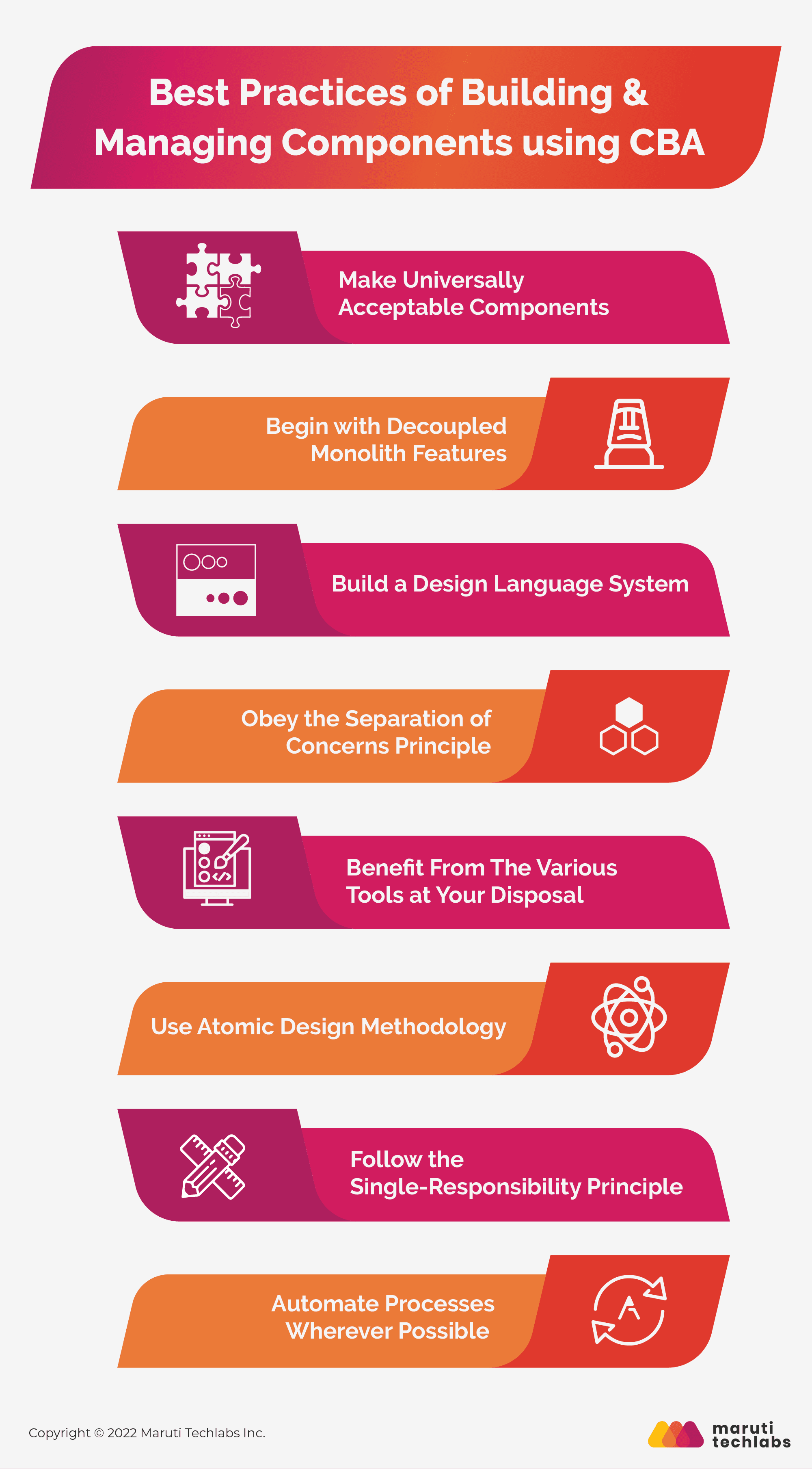
Best Practices of Building & Managing Components using CBA
How to Build & Manage Reusable UI Components: A Hands-On Tutorial
Here’s How We Built and Scaled WotNot - A No-Code Chatbot Platform
Let's be honest: meeting the ever-increasing app demand while maintaining existing technology can be difficult for any development team. Building an app is a bit like baking a cake. You need all the right ingredients to come together quickly, and you must be careful not to break anything already working. And the perfect way to build scalable web applications is by using component-based architecture.
In today's world, applications require close collaboration between third-party technologies to function as one cohesive unit. Most software systems are not new, but based on previous versions, it is possible to create a unique design by utilizing pre-made "components" (or modules) instead of rewriting the whole code from scratch.
Component-based development is all about the reuse and easy assembly of complex systems. You can build quality by design by integrating the same components repeatedly and creating repeatable processes - much like you would with LEGOes!
To help you unpack the valuable results of component-based architecture, in this article, we will dive deep to understand how to scale the front end using component-based development. We'll also discuss component reusability and how Maruti Techlabs, a leading product management consulting firm, built and scaled our custom chatbot platform-WotNot. So, let's jump right in!
Best Practices of Building & Managing Components using CBA
Knowing the benefits of component-based development is one of the best ways to create a front-end structure for the future. If you still have to deal with a front-end monolith, now is the right time to start moving toward this modular approach. Here are some essential practices to remember while implementing this architecture:
1. Make Universally Acceptable Components
You will utilize the components you create across several applications, not simply the one they were designed for. As a result, it is critical to convey the greater purpose of these components to your engineers, as other teams and individuals will likely utilize them.
2. Begin with Decoupled Monolith Features
It's challenging to work with monolith applications as the functionalities here are highly interdependent. Try to identify the features that can be decoupled and exist by decomposing the monolith into a modular system.
Design systems are the guidelines of development used in creating the brand identity. The different methods designers use to build the structure of a website are called design systems and can help determine how components are enabled from one platform to another.
These standards help you create a foundation for an integrated theory and practice related to page layouts, page formats, and overall information architecture. They could greatly assist your team members in their daily work while consolidating efforts so that other departments or third-party vendors understand where they have jurisdiction when it comes time to sell some of your products or services.
4. Obey the Separation of Concerns Principle
To accomplish the true reusability of components, you must adhere to the separation of concerns principle. Keeping the two logics distinct allows you to maintain flexibility while making life easier for other teams engaging with the component. It is especially true for front-end components when design and business logic are applied to a component at the same time.
5. Benefit From The Various Tools at Your Disposal
Many tools are available to help make the job of a front-end developer easier. From managing dependencies to testing environments, here is a list of things you might find helpful while working on your next application:
Storybook: It allows you to design components for your project in total isolation, letting you focus on the components' testability and reusability.
Styleguidist: This dynamic documentation helps you with a brief overview of multiple variations of different components.
Testing: Various tools can be used to perform different testing strategies over your applications, such as unit testing, integration testing, and end-to-end testing. For this, you can use Postman, Cypress.io, and Jest.
Linters: It makes coding easier by highlighting programming flaws, bugs, aesthetic problems, and dubious structures.
6. Use Atomic Design Methodology
Brad Frost presented Atomic Design, a practical way to develop interfaces inspired by chemistry. It suggests a consistent vocabulary for referring to components and the labeling structure.
The different stages in Atomic Design are:
Atoms
Molecules
Organisms
Templates
Pages
By combining this technique with component-based architecture, you are also adopting a generally acknowledged language used by the Atomic Design community worldwide.
7. Follow the Single-Responsibility Principle
Even a component can get bloated over time, with different members adding more functionalities for various use cases. In such scenarios, the single-responsibility principle can be helpful in such a scenario. When a single component contains many props responsible for too many elements, we can divide these props into multiple more granular components such that each serves a singular purpose only.
8. Automate Processes Wherever Possible
The importance of automation in any development, especially component-based development, cannot be overstated. It is encouraged to identify various approaches to automate your development process, as doing so would make it simpler to adhere to established guidelines.
If you want to revolutionize your web app development process and make it easier to scale, component-based architecture (CBA) could be the solution you need. This popular approach to web app development involves breaking the app down into smaller, reusable components, which can save time and reduce the risk of errors.
In the world of SaaS application development, scalability is key. And that's where a component-based architecture can shine. With the right framework and best practices, component-based architecture can help you quickly build and iterate on your application, making it easier to stay ahead of the competition and meet your customers' needs.
As a trusted web development New York partner, Maruti Techlabs leverages component-based architecture to build scalable, maintainable, and high-performing web applications that align with your business goals.
How to Build & Manage Reusable UI Components: A Hands-On Tutorial
react reusable component is a building block we can use or create as many times as we want to form something more significant, such as using multiple buttons in different parts of your application to build one UI instance.
The pattern of creating React elements is helpful because it cuts down on the amount of time needed to write code for each element. This way, development goes faster, and the codebase becomes simpler. Additionally, less repetitive debugging is required, which makes for easier code maintenance overall.
Component-based development can be a great way to create modular and reusable code for your project. In this article, we'll walk through an example of creating a popup modal using a Storybook and various HTML elements as reusable components. We'll use "React Hooks" to manage and manipulate the state data, which will help us create reusable React components for our project.
In this component, we're using the 'useState' hook to access state data. The 'content' prop will help us render the component's value, passing data in as an array. It will generate different properties of the component, each with a label.
Now that you've mastered some core concepts, let's look at how to build each type of component:
1. Radio Component
A RadioGroup is a wrapper used to group Radio components that provides an easier API and adapts to different keyboard layouts better than individual radio components. When a user needs access to all available options, it's best to use radio buttons. However, if the options can be collapsed, a Select component would use less space and might be a better choice.
To create a radio component, we need to bind some listeners with the ‘handleChange()’ method. This method returns a callback activated once the user clicks on any radio button. The passed data is saved in our state when the user clicks on the radio button. This state shows the selected checkbox passed as the checked props for the RadioGroup Component.
The 'align' prop determines how you should align a screen view. Alignment options include vertical and horizontal.
A Dropdown is a staple in any web application. It means faster development time, fewer bugs, and fewer bytes. You can also use drop down across the web, so it's wise to have a custom dropdown component. That way, you'll write less code and can have different variants in the dropdown component while building a UI.
The 'onChange()' event handler is very important for dropdown components because it tracks whenever the user changes the selected option. It is essential because a dropdown component needs to know when the user changes their chosen option. The 'onChange()' event handler is also fired automatically whenever the user changes the option chosen so that we don't have to worry about it ourselves.
The most common UI element is the button. You can use it for anything, including a "login" button, a "delete" button, a "play" button for video, or a "Sign in with Facebook" button. As every button should be consistent with providing a consistent user experience to the user, these common UI elements must be easily accessible to developers to be used repeatedly. You can do this by creating a reusable button component.
The button component uses the 'onClick()’ method as its event handler, as shown in the example below. onClick() allows you to call a function and perform an action whenever an element is clicked in your app. So, whenever a user clicks a button or any feature within our app, the onClick() method calls a function, which triggers an action we want to perform on a user click.
When creating the tag input, we need a container to wrap all tags and an input field in which all tagged names are filled. This component is being used to show multiple tags in one input field & increase the readability of the multiple values(tags) by providing a rich UI. It also has support for removing tags by a cross icon. When we add more tags, we’ll have an internal scrollbar as here we have provided the maximum lines we want to keep for the input area by `maxRows` props…
The ‘handleChange()’ method for the tag input component is critical for calling the update state function. This function helps change the component's state based on the user's value. The code snippet below provides a better understanding of how to build a tag input component.
Popup components can be shown on top of any screen by blurring the rest of the background. You can create a popup component showing the different fields in a single Modal. Here we’ve combined four reusable components - a radio, a dropdown, a button, and a tag input. We’ll integrate these components in one Popup component & will create a Modal type component. For further clarity, the code snippet for the popup modal is shown below, along with the output of the code.
Component Reusability: For Faster Frontend Development
Component-based architecture is amazing for several reasons, but one of the best is reusability. The reusability aspect of component-based development reduces the number of developers needed to create great products within a short period. Hence, this allows your team to focus on more essential business requirements. Logic components are context-free, and front-end components already have great UX and UI. Therefore, developers only need to worry about connecting them in agreement with the application's business rules.
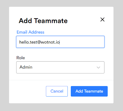
To understand the reusability of various components, let's look at the example of creating a new "Add Team" page using the reusable dropdown and button component discussed above. In addition to the dropdown and button component, this page consists of a new “input” component for entering the email address of the team member you're adding to the database. Let's take a closer look at the input component below:
Input Component
A reusable input component is a user interface element that you can use in any part of your application to enter data from the user. One advantage of using a reusable input component is that you maintain the appearance of the input in various parts of your application. By creating this type of component, you can ensure that all places where user-entered data appears will have a consistent look.
As seen in the screenshot below, using the ‘handleChange()’ event handler helps us update the user's input inside the state function according to the value from the ‘event.target.value’ property.
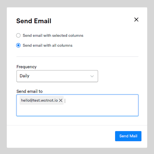
Combining the above reusable components, i.e., button, dropdown, and input component, create a popup modal for adding the team member, as shown in the screenshot below.
However, when working with such an extensive collection of components, it can be challenging to store and reuse them all in a way that makes them readily available to developers. Storybook, an open-source library for UI components, is where all your visual components can come together in one place. It makes it easier to make changes and see what works and doesn't work before committing back to the codebase, saving you time and effort when developing applications. However, when working with such an extensive collection of components, it can be challenging to store and reuse them all in a way that makes them readily available to developers.
Storybook helps you build vital UI components with any framework like Vue, React, or Angular. With Storybook, it's easy to declare, manage and document your UI components, and you can even develop UI components in isolation.
As you write all your components in isolation, disregarding business logic, you potentially emphasize reusability, ultimately improving the code quality. Hence, Storybook is the best way to access your project's components and documentation to visualize its appearance and behavior and understand its usage, resulting in faster Frontend development.
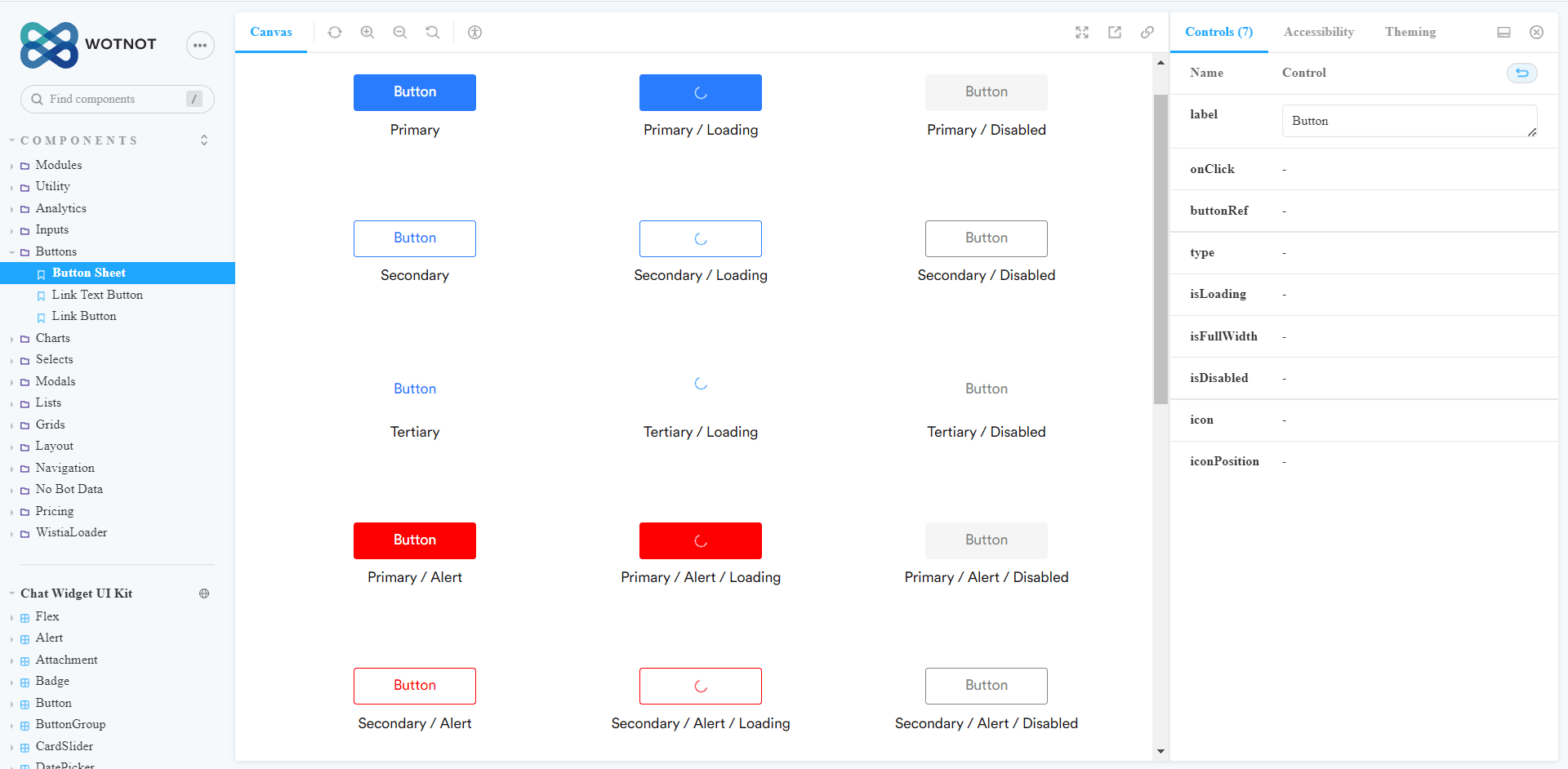
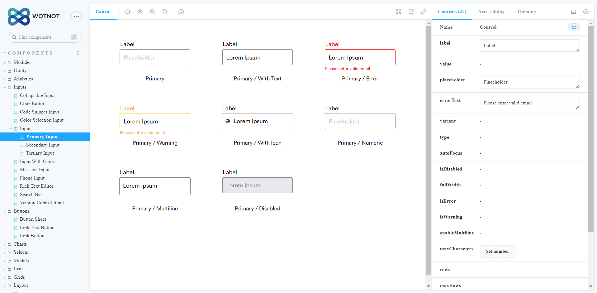
When trying to get an idea of how a Storybook can be used to reuse a component, here are the screenshots of the Storybook for the button and input component below:
Button Component
Input Component
Component-based architecture is an excellent approach for scaling front-end development, but you will need skilled mobile app developers for its successful implementation. Hire dedicated mobile app developers from a company like ours that has demonstrated expertise in component-based development, reusability, collaboration, and quality assurance. We can help you build a cutting-edge mobile app that meets user expectations and grows with your business needs.
Here’s How We Built and Scaled WotNot - A No-Code Chatbot Platform
One of our long-term clients came to us with a genuine problem many businesses have. Their employee base responsible for providing customer support and service was overwhelmed with calls throughout the day, so much so that it became impossible for their employees to respond promptly, leading to longer wait times, ultimately resulting in expensive solutions. Suffering from poor customer experience, this, in turn, led to a below-par brand image and a significant loss to the business.
As WotNot's customers began to create bots on other platforms, they discovered that every customer onboarding required long hours of training and hand-holding. It led to less than stellar customer experiences and a lot of lost sales - meaning that WotNot would have to build something better and more seamless for their clientele. With little time and an excitable team at WotNot, we decided to forego coding altogether and integrate a no-code bot builder into the framework to minimize any potential friction from end to end.
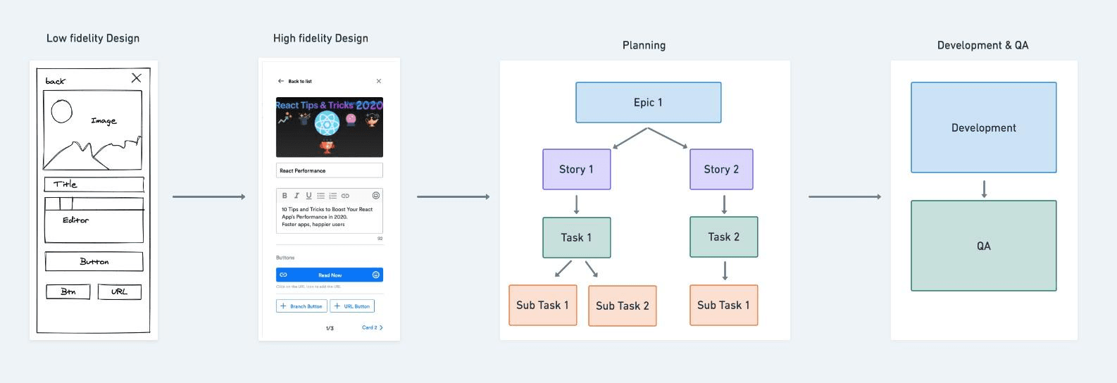
The research and design process for developing WotNot began with planning and development, which included doing initial customer research and coming up with a sketch of the final product. Plans were made, stories were written, and tasks were assigned-everything broken down into smaller manageable steps.
Doing this ensured that all the functions and processes could be accessed to guide the work.
As with any project or start of a business designed with an agile approach, the need to stay flexible and adaptable at every stage of development is crucial. Therefore, working closely with our customers using agile software development methodologies helped us to complete the project on time and incorporate feedback from our client into each story before moving on to the next one. The process continued, and that’s how WotNot was born.
We followed a few steps before locking down on WotNot’s architecture, starting with exploring different libraries using tools such as React Diagrams and JointJS. It was followed by building the interface design system using atomic design principles.
Later, the team designed multiple theme support using CSS and a combination of concrete variables, functions, and placeholders. Finally, the scalability and performance issues were addressed by monitoring the component’s rendering time, optimizing re-rendering, and load testing with 1000 nodes to analyze the problem.
Since then, WotNot has been helping businesses cut costs and improve customer experience. We have a history of developing intuitive, effective customer service solutions that deliver measurable ROI for our clients.
Intense competition, complex market scenarios, and disruptive technologies have made it crucial for every business to look at options for optimizing costs, improving overall accuracy, and maximizing returns.
Component-based architecture is a great way to help you solve this issue.
Rather than having a homogenous set of code that runs things, you can create small chunks, namely components of your code, that perform the tasks you want. These components may interact with other components, ultimately unpacking all the benefits of component-based development.
At Maruti Techlabs, we help you develop products that are sleek, modern, and rich in functionality. We offer comprehensive new product development services, from UI/UX to development, product maturity, and maintenance, as well as the building of AI modules within the product.
Whether it's legacy systems or new applications using component-based development, we ensure that your product is delivered on time, exceeds industry standards, and is cost-effective.
Contact us to build your web solutions with our outstanding experts from an elite team of front-end developers.
Whether you're a startup or an enterprise looking for expert web development Los Angeles services, Maruti Techlabs delivers scalable front-end solutions tailored to your business needs.
Hamir Nandaniya leads product development and engineering across platforms, including Salesforce, web, and mobile. With over 20 years of experience across Java, Salesforce, AWS, and conversational bot development, he has spent his career bridging customer business needs with scalable technical solutions.
Stuck with a Tech Hurdle?
We fix, build, and optimize. The first consultation is on us!


