

Why Responsive Web Design is a Must-Have for Your Web Strategy
The concept of Responsive Web Design can be aptly summarized by a quote from Steve Jobs, “Design is not just what it looks like and feels like. The design is how it works.”
Responsive Web Design (RWD) is a web development technique which effectively optimizes the browsing experience of the user by crafting website which fits into the user’s device. The optimal viewing experience is achieved by easy reading and navigation through minimum re-sizing and scrolling across a wide range of devices. Thus, RWD combines three concepts namely flexible widths, flexible images and media queries.
History of Responsive Web Design
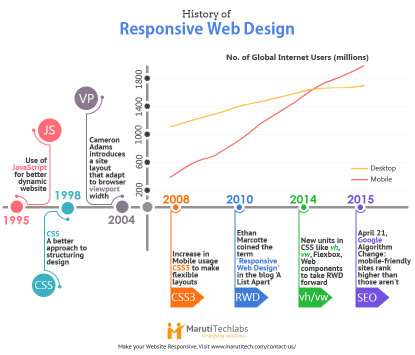
In 2014 mobile surpassed desktops in term of global internet usage. This has lead to a change in website design to give better user experience in the handheld devices. In 2010 Ethan Marcotte, web designer and author coined the term ‘Responsive Web Design’ and explained the importance of fluid grids. Subsequently new features have been added in CSS like vh,vw (viewport height and width) allowing greater flexibility to position elements. Flexbox and Web components have introduced change in layout and making elements reusable building blocks.
Are you planning to build a responsive website but don’t know where to start? Our IT outsource consulting services can help. Our expert web developers help deliver an improved user experience while optimizing the time and cost of development.
Advantages of Responsive web design
1. User Experience
Consistency in user experience is achieved when the website looks the same on all platforms. The core tenet of RWD is to make content fluid so that visitors browsing through their mobile or tablet, view all of website content as easily as desktop users. Many times we find an interesting content on a website while browsing on our computer, and want to send it to a friend who will view it on their phone. If the website is responsive and has been designed well, the content will work exactly the same on both screens. The ultimate effect – website makes it easier for visitors to find, absorb, and pass on this content.

To ensure a consistent and seamless user experience for your mobile applications, consider hiring dedicated mobile app developers from a company like ours that has a valued portfolio of launching successful mobile apps. We take care of your cross-platform development, responsive design, and performance optimization, which delight your end-users across all platforms.
2. Online presence
Responsive design helps websites appeal to modern users; users who are likely to surf the internet using a mobile or tablet device, but who still expect their desktop experience to be as smooth as ever. Going responsive is the most effective way to make the most of mobile and tablet traffic. No matter what screen the visitor uses, it will look professional. This keeps customers coming back. Ultimately increases the online presence and attracts wider audience.
3. Branding
Creating a responsive website will visually capture your brand message consistently on all platforms engaging a larger part of your market. This will help in enhancing your brand image and awareness, thus helping in attracting business.
4. Maintenance
A responsive website eliminates the need for two separate websites for desktop and mobile devices. So, at the time of change, only one website requires updating. This leads to significant savings in maintenance cost and time.
Your maintenance activities also hugely depend on your web application development framework. For example, ASP.NET offers several advantages concerning maintenance, providing ease for web administrators and developers to effectively manage web applications.
.NET also simplifies maintenance activities by reducing development overhead and offering a similar user experience across different devices. This results in cost savings, improved SEO, and easy content management.
Yet, achieving this feat is easier said than done. Therefore, we suggest you contact a web development New York partner like Maruti Techlabs when building a web application. Our expertise in .NET development services will expedite your development process manyfold while ensuring scalability and long-term maintainability.
5. Conversion rate
Many brick and mortar stores have come up with their online stores. A unified user experience helps the customer in taking quick decisions leading to online purchases. The website will become a useful outlet for sales because it reaches the target audience and a niche fan base.
To improve your website's responsiveness and optimize it for search engines, Maruti Techlabs' website application development services can help. Our team of experts specializes in creating high-quality, responsive websites that deliver a superior user experience and drive traffic to your site, all while meeting your unique business needs.
Search Engine Optimization (SEO) benefits of RWD
1. Google favors Responsive
‘Focus on the user and all else will follow.’
Google’s philosophy is focused on providing the best user experience. Responsive design emphasis on designing for the user – and with user experience being a big ranking factor, it makes sense that Google is encouraging developers to embrace RWD. Continuing with the same trend Google has announced a change in its search algorithm from April 21 (dubbed ‘mobilegeddon’) where mobile-friendliness will be a key factor in deciding the overall rank of the website.
2. Single URL
As there is no need of developing a separate site for mobile devices a single URL serves as a unique identity for the website. Absence of multiple URLs for a single entity helps in non-dilution of page rank and keeping the back-end work effective and lean.
3. Low bounce rate
Many times the mobile content is stripped down to the extend that it becomes too dissimilar to original content on the website or the page requires horizontal scrolling. These two factors leads to user dissatisfaction and ultimately increases the bounce rate and negatively affects the page rank of the website.
Are you seeking to boost your website's search engine ranking and user engagement? Our UI/UX design service can help. By enhancing the visual appeal and functionality of your website, our service can increase the time users spend on your site, resulting in lower bounce rates and improved search engine rankings.
You can also hire dedicated React.js developers who specialize in designing intuitive and interactive UI/UX by connecting with us. Having years of experience, our experts can help you weave the ultimate user experience related to your services or products.
Design cannot rescue failed content
Responsive web design makes the website presentable, user-friendly, interactive and profitable. But the core of website remains an informative, lucid and accurate content. Without a well researched content responsive website would look like a shallow decorative piece.
Make your website ‘Responsive’ and ready for Algorithm change
Use the following steps to ensure your website scores well in the Google page rank by making it mobile-friendly using Responsive Web Design.
Step 1: Google’s Mobile-Friendly Test
Google offers a free test to check the mobile friendliness of your website. If the result is green ‘Awesome’, sit back and celebrate. If it’s red ‘Not mobile-friendly’, don’t get disheartened, just follow the subsequent steps to make it mobile-friendly.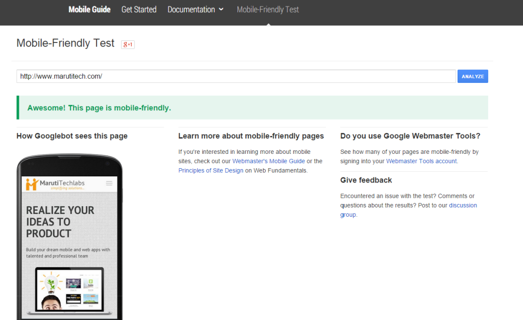
Step 2: Google webmasters tools to check mobile usability
Google webmaster is an excellent analytics tool to understand the mobile usability statistics. The dashboard is designed to identify specific issues affecting your mobile-friendliness. The tool shows individual errors and redirects you to a specific issue.
Step 3: Time to fix the issues
If the website is internally managed ask your developers to fix the errors immediately. For externally managed sites ask your website provider for an estimated technology migration cost to upgrade your website to a mobile responsive theme.
Step 4: Frequent testing
Test the changes frequently to identify any bugs in the earlier stage of transformation. Once the site has been redesigned check every page to ensure the links are working and pages are loading properly. Also run it on different devices such as iPhone, Tablets, and other smartphones.
Several web frameworks can help achieve a responsive web design, and Angular.js is one among them. It enhances the user experience (UX) in web applications and creates a smoother and more interactive user interface. For the most effective results, consider hiring Angular experts.
Conclusion
Responsive web design allows you to stay ahead in the competition. As the demand for content rich mobile sites and apps has overshadowed desktop internet usage, RWD presents a refreshing solution for providing better user experience, strong online presence, lower maintenance cost and effective SEO. With Google’s latest algorithm change RWD will be the deciding factor in page ranking and ultimately conversion rates.
We understand that in today's digital landscape, responsive web design is not an option but a necessity, and our product development services are tailored to deliver just that.
If you're inexperienced in this area, the best path for enabling responsive web design is by onboarding dedicated Python developers. This would ensure dynamic and efficient front-end and back-end development.
If you're ready for the latest technology change and want to make your website responsive, Maruti Techlabs specializes in providing product management consultancy which can help you optimize your website for responsive design, delivering a seamless user experience and boosting your search engine rankings. For more details visit Maruti Techlabs
As a trusted software development company in Dallas, we combine local insight with global expertise to help you build responsive, high-performance web solutions.


